Bendy Stretching Classes
Bendy is a welcoming space that offers stretching classes in Vancouver, BC. If you want to touch your toes, improve your posture, or simply feel good, Bendy got you.
As a brand-new business, they needed a strong visual identity to resonate with their audience and convey the essence of stretching: self-love, strength, flexibility, movement, and inner peace.
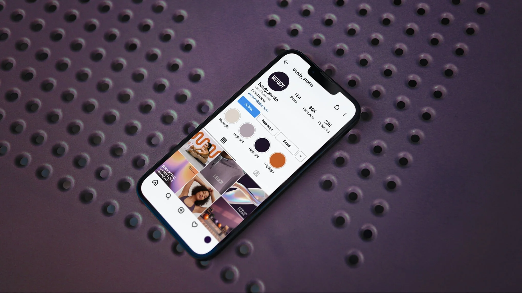
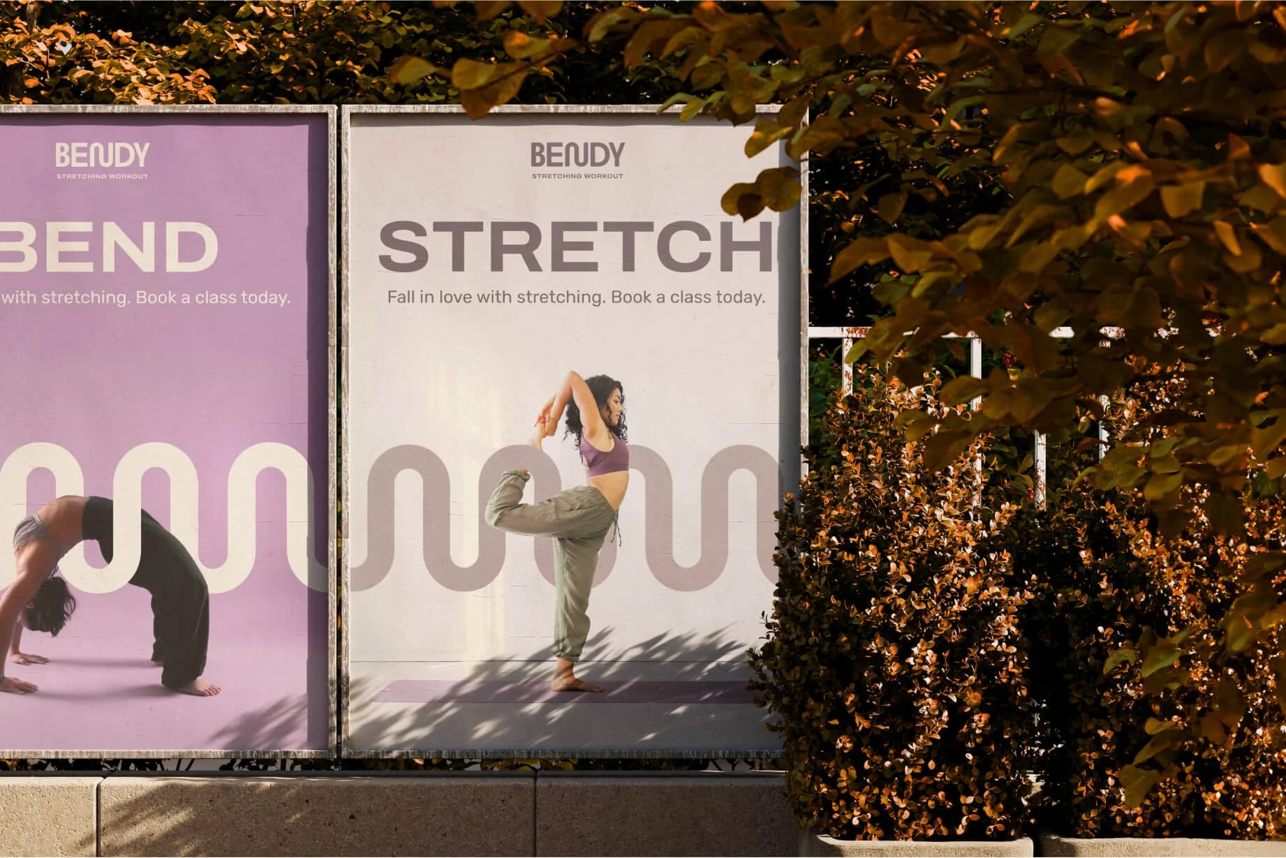
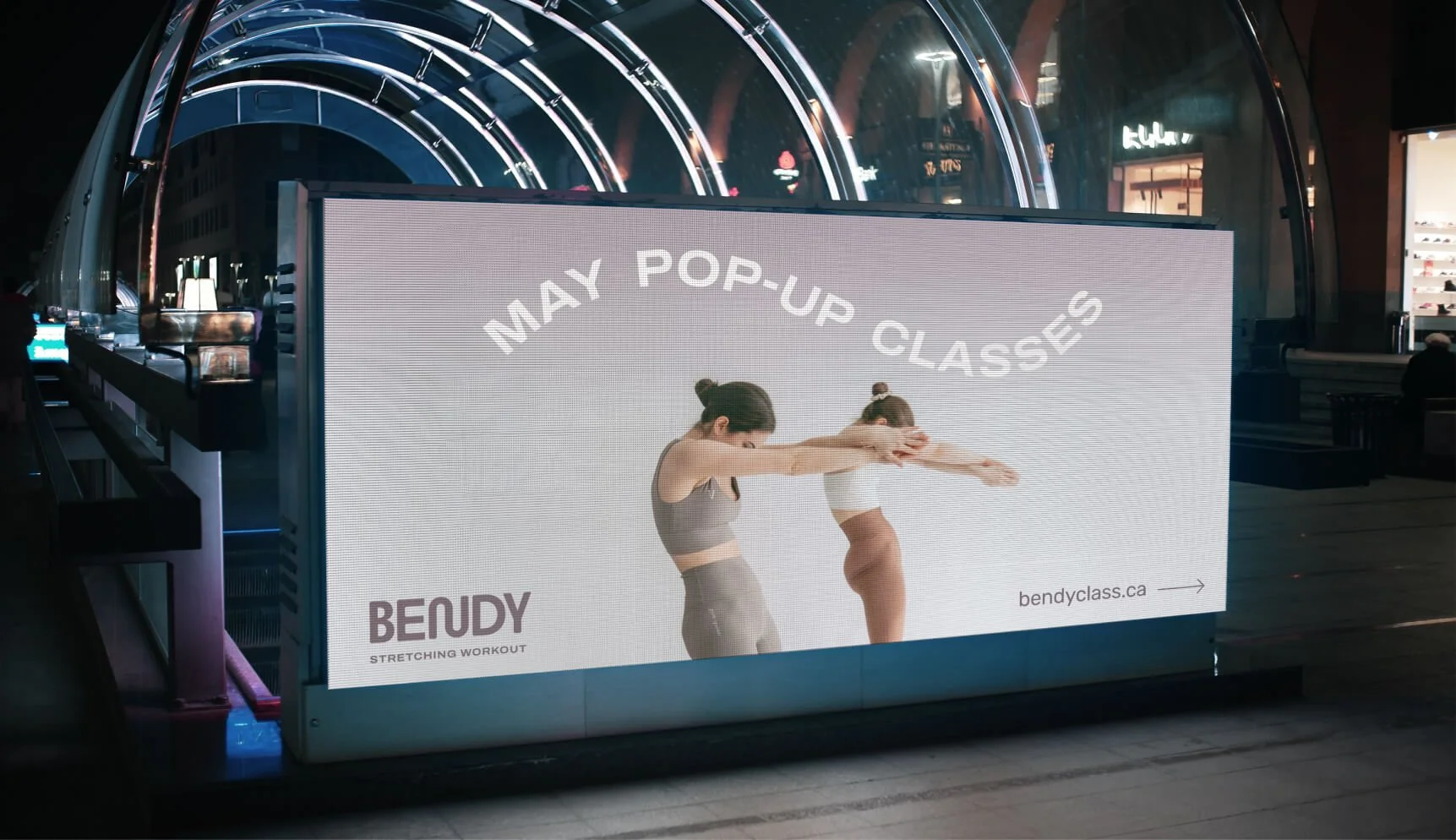
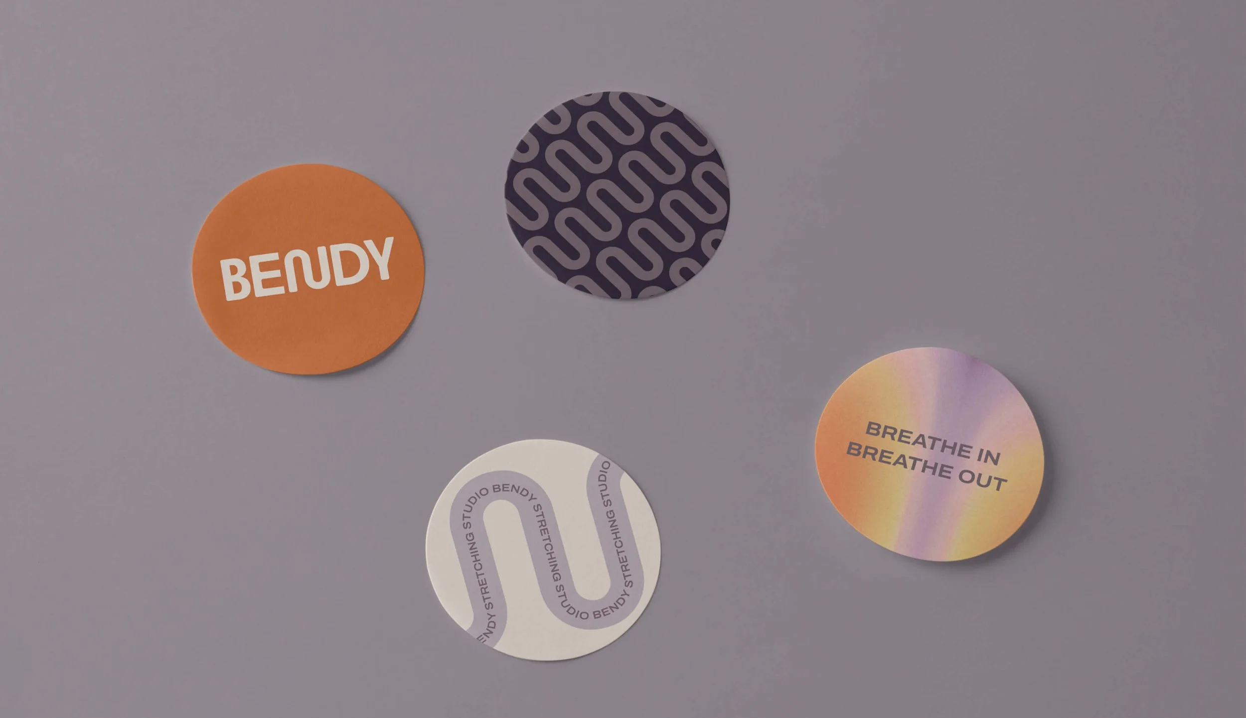
I centered Bendy’s visual communication around the idea of grounded movement and plasticity, symbolized by the wavy bending line. This line features in the logo’s letter "N" and throughout the brand’s visual elements and patterns. The visual identity is also supported by bold and modern sans-serif fonts, a warm and earthy color palette, soft gradients, and light, spacious photography.
The final results of my work included Bendy’s brand positioning, visual identity, motion graphics, and website design.


